Security News
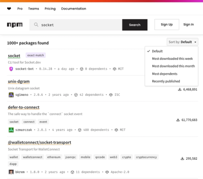
npm Updates Search Experience with New Objective Sorting Options
npm has a revamped search experience with new, more transparent sorting options—Relevance, Downloads, Dependents, and Publish Date.
@rmwc/icon
Advanced tools
Material icons use geometric shapes to visually represent core ideas, capabilities, or topics.
Icons are not part of the official material-components-web spec, but they are referenced many times in the documentation. RMWC provides a declarative way to use icons. Note that RMWC does not ship with any icons of its own. You can include Material Icons, any other font icon set, use SVGs, or your own images.
By default, the Icon component will attempt to detect the strategy for the icon you are embedding. For example, it assumes if pass something that starts with http:// to the icon prop that you are attempting to load an image and will render it accordingly. Beacuse of ambiguity with ligatures verses icons added using classNames, you might have to explicitly set the strategy by passing it in as an option, or setting it as a global default using the RMWCProvider.RMWCProvider provides other global icon options. Please see the "Provider" section for more detail.
The default strategy is 'ligature' which works with the material.io font icon set.
The Icon component, (really the icon prop itself) can accept a variety of formats. Anywhere you see a component prop like icon or trailingIcon will inherit the same behavior.
<Icon icon="favorite" />
<Icon
  icon={
    <div
      style={{
        background: 'green',
        width: '24px',
        height: '24px',
        borderRadius: '100px'
      }}
    />
  }
/>
<>
  {/**
    If you have additional options,
    you can pass an object of options to the icon prop.
  */}
  <Icon icon={{ icon: 'star', strategy: 'ligature' }} />

  {/**
    Passing additional props is especially helpful when the entire icon
    component isn't exposed. In this example we pass the additional
    onMouseOver prop directly to the icon
  */}
  <Button
    label="Hello!"
    icon={{
      icon: 'add',
      onMouseOver: () => console.log('OVER')
    }}
  />
</>
The Material spec details multiple sizes for icons. The Icon component doesn't assign a size by default, but these are available to you to force a size. Please note, this will only work if you've included the RMWC icon css file.
<>
  {/* 18px */}
  <Icon icon={{ icon: 'favorite', size: 'xsmall' }} />
  {/* 20px */}
  <Icon icon={{ icon: 'favorite', size: 'small' }} />
  {/* 24px */}
  <Icon icon={{ icon: 'favorite', size: 'medium' }} />
  {/* 36px */}
  <Icon icon={{ icon: 'favorite', size: 'large' }} />
  {/* 48px */}
  <Icon icon={{ icon: 'favorite', size: 'xlarge' }} />
</>
This is for icon fonts that support ligatures like material-icons. This is the default strategy if nothing is set and doesn't require any additional setup if you are using material-icons.
<>
  <Icon icon="favorite" />
  <Icon icon="favorite_outline" />
  {/* Example showing how to set the strategy explicitly */}
  <Icon icon={{ icon: 'star', strategy: 'ligature' }} />
</>
This is for icons that are accessible via HTTP(S) and will be loaded directly into an img tag. This can be auto-detected for things that look like urls. The image will be set as a backgroundImage of the icon. Make sure you impor the RMWC icon css file for this to work properly.
<>
  {/** Auto detection */}
  <Icon icon="images/icons/twitter.png" />
  {/** Explicit */}
  <Icon
    icon={{
      icon: 'images/icons/twitter.png',
      strategy: 'url'
    }}
  />
</>
This will render a child component inside of the icon. This is useful for all sorts of customization and for rendering inline SVGs. The following example shows rendering an SVG, as well as an arbitrary div.
<>
  {/** Auto detection */}
  <Icon
    icon={
      <div
        style={{
          background: 'green',
          width: '24px',
          height: '24px',
          borderRadius: '100px'
        }}
      />
    }
  />
  {/** Explicit */}
  <Icon
    icon={{
      strategy: 'component',
      icon: (
        <svg
          style={{ width: '24px', height: '24px' }}
          viewBox="0 0 24 24"
        >
          <path
            fill="#4285F4"
            d="M21.35,11.1H12.18V13.83H18.69C18.36,17.64 15.19,19.27 12.19,19.27C8.36,19.27 5,16.25 5,12C5,7.9 8.2,4.73 12.2,4.73C15.29,4.73 17.1,6.7 17.1,6.7L19,4.72C19,4.72 16.56,2 12.1,2C6.42,2 2.03,6.8 2.03,12C2.03,17.05 6.16,22 12.25,22C17.6,22 21.5,18.33 21.5,12.91C21.5,11.76 21.35,11.1 21.35,11.1V11.1Z"
          />
        </svg>
      )
    }}
  />
</>
Some font icon sets like Ion Icons and Glyph Icons render based on a className that is set. RMWC docs doesn't include extra icon fonts so there is no example to render, but the below code should give you an approximation.
THIS CANNOT BE AUTO DETECTED. You'll have to explicitly set the strategy directly on the Icon or specify it globally via the RMWCProvider.
<>
  {/* Ion Icons <i class="icon ion-star"></i> */}
  <Icon
    icon={{
      icon: 'star',
      strategy: 'className',
      basename: 'icon',
      prefix: 'ion-'
    }}
  />
  {/**
   * Set the option globally throug RMWCProvider
   * Glyphicons <span class="glyphicons glyphicons-heart"></span>
   **/}
  <RMWCProvider
    icon={{
      strategy: 'className',
      basename: 'glyphicons',
      prefix: 'glyphicons-'
    }}
  >
    <Icon icon="heart" />
  </RMWCProvider>
</>
Sometimes, you just need to do your own thing. Maybe you have a legacy project that already has icons and you want to incorporate them with RMWC. If none of the other strategies are what you need, then you can hijack the whole thing and delegate it to your own render function.
<Icon
  icon={{
    icon: 'favorite',
    strategy: 'custom',
    render: ({ content }) => <div>Hello + {content}</div>
  }}
/>
A more relevant example involves an app that has a custom / existing icon component. There are a litany of reasons why your app might need one, but if you've found this section of the docs you likely know what problem you need to solve.
  // 1) Your app has an icon component you use
  import { MyIconComponent } from '@rmwc/icon';
  <MyIconComponent name="search" />

  // 2) Now you are using RMWC, lots of components are instances of Icons
  // You need to be able to delegate the handling of an icon prop to your own component
  import { TextField } from '@rmwc/textField';
  import { Chip } from '@rmwc/chip';
  <TextField icon="favorite" />
  <Chip icon="favorite" />

  // 3) Instead, you should set the custom strategy to be your default
  // and add your own handling with RMWCProvider
  import * as React from 'react';
  import * as ReactDOM from 'react-dom';
  import App from './App'; // your main app component
  import { RMWCProvider } from '@rmwc/provider';
  import { MyIconComponent } from '@rmwc/icon';

  const iconRenderHandler = ({ content, className, ...rest }) => {
    // content is whatever was passed to the icon prop

    // className is the fully processed className taking into account the basename and prefix defaults
    // it's important to include this because MDC often has classes like text-field-icon directly
    // on the component for alignment

    // rest is just any other props
    return <MyIconComponent className={className} name={content} {...rest} />
  };

  ReactDOM.render(
    <RMWCProvider icon={{strategy: 'custom', render: iconRenderHandler}}>
      <App />
    </RMWCProvider>,
    document.getElementById('root')
  );

  // 4) Now anywhere in your app that an Icon instance is used, it will be
  // delegated to your handler and render your custom component
  import { TextFieldIcon } from '@rmwc/textfield';
  <TextFieldIcon icon="search" />
An Icon component. Most of these options can be set once globally, read the documentation on Provider for more info.
| Name | Type | Description |
|---|---|---|
icon | RMWC.IconPropT | The icon to use. This can be a string for a font icon, a url, or whatever the selected strategy needs. |
FAQs
RMWC Icon component
We found that @rmwc/icon demonstrated a healthy version release cadence and project activity because the last version was released less than a year ago. It has 0 open source maintainers collaborating on the project.
Did you know?

Socket for GitHub automatically highlights issues in each pull request and monitors the health of all your open source dependencies. Discover the contents of your packages and block harmful activity before you install or update your dependencies.

Security News
npm has a revamped search experience with new, more transparent sorting options—Relevance, Downloads, Dependents, and Publish Date.

Security News
A supply chain attack has been detected in versions 1.95.6 and 1.95.7 of the popular @solana/web3.js library.

Research
Security News
A malicious npm package targets Solana developers, rerouting funds in 2% of transactions to a hardcoded address.